


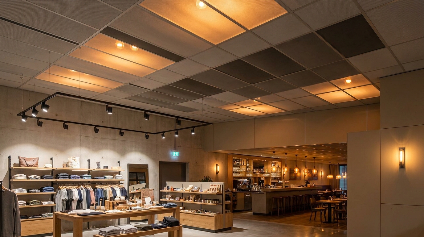
Most Jakarta commercial spaces get lighting wrong in the same three ways. A flat grid of ceiling panels that makes the room feel like a clinic. Mixed color temperatures within the same view, so the space reads broken. And accent lights pointed at nothing, because nobody planned where the eye should land.
Lighting is where a fit-out either earns its budget or wastes it. A well-lit 40 sqm cafe with cheap furniture feels warmer than a badly lit 200 sqm boutique with imported stone. The specs are not complicated once you know what to ask for, but almost no designer explains them to owners in plain terms. Here is what commercial lighting design is, why it changes how a space works, and how to think through the specs before you sign a quote.
What commercial lighting design actually is
Commercial lighting design is the process of deciding how much light, of what quality, from which direction, hits every surface a person can see. Fixture selection is the last step. The real work is planning brightness levels, layers, and color quality against how the space is used.
Every commercial lighting plan has three layers. Ambient light gives you general brightness across the floor. Task light concentrates on where people work — the till, the desk, the treatment chair. Accent light picks out the things you want people to notice — merchandise, artwork, a signature wall. Skip a layer and the room reads as one flat, monotonous plane. Combine all three and the same square meters gain depth.
Why it matters more than most owners think
Retail is the clearest case. In a shop, the contrast ratio between ambient and accent lighting is what pulls the customer's eye to the product. A 3-to-1 or 5-to-1 contrast makes merchandise look premium. A flat, evenly lit shop makes everything look like it belongs in a supermarket. That is a pricing conversation you did not know you were having.
Office work is the next case. Fluorescent glare on a screen causes eye fatigue and headaches within hours. In an open-plan floor with 500 lux measured at the desk but a UGR (Unified Glare Rating) above 22, half your staff will drift home with a headache by 4pm. The productivity loss dwarfs whatever you saved on cheap fixtures. Good acoustic design for open-plan offices needs to sit next to good lighting design, because both attack the same problem: whether the room lets people focus.
Hospitality is the third case. Restaurant lighting sets the entire mood. Warm, low light with pools of brightness over each table reads as intimate. Bright uniform light kills a dinner atmosphere and sends customers home earlier, which cuts your average bill.
The four specs that decide everything
Any lighting proposal you receive should answer four numbers per zone. If it does not, ask.
Lux — how bright the surface is
Lux is illuminance, measured at the working plane (usually 75 cm off the floor for desks, or the counter surface for retail). The Indonesian SNI 6197 gives you baseline targets. General office work sits at 300 to 500 lux. Detailed drafting or accounting wants 500 to 750 lux. Retail general lighting runs 300 to 500 lux, with accent lighting on merchandise reaching 1500 to 3000 lux. Restaurant dining sits far lower, at 100 to 200 lux. A warehouse floor works at 200 lux. Meeting rooms want 300 to 500 lux with dimming.
Underlighting a workspace causes fatigue. Overlighting a restaurant kills the atmosphere. Neither is a matter of taste; both come from a spec sheet.
Color temperature — the kelvin number
Color temperature is measured in Kelvin (K). Lower numbers are warmer (yellow-orange). Higher numbers are cooler (blue-white).
- 2700K to 3000K: warm white. Restaurants, cafes, hotel lobbies, retail with warm merchandise (fashion, leather goods, jewelry against gold tones).
- 3500K to 4000K: neutral white. Offices, clinics, banks, retail with mixed merchandise.
- 5000K to 6500K: cool white. Warehouses, industrial spaces, jewelry with diamond emphasis. Rarely appropriate for customer-facing zones.
The rule most contractors break: never mix color temperatures within a single visual field. A 3000K pendant next to a 4000K downlight looks like one of them is broken. Pick one temperature per zone and stay disciplined.
CRI — how honest the color looks
CRI (Color Rendering Index) measures how accurately a light source shows the true color of what it hits, on a scale to 100. Daylight is 100. Cheap LED panels can drop as low as 65, which is why food photographed under them looks grey.
For offices, CRI 80 is the minimum. For retail selling clothing, cosmetics, or food, you want CRI 90 or above. The price difference between a CRI 80 fixture and a CRI 90 fixture is small compared to what happens when your merchandise looks worse in-store than it does online.
UGR — the glare number
UGR (Unified Glare Rating) tells you how visually uncomfortable a fixture is. Lower is better. For offices with screens, you want UGR below 19. For retail, below 22 is acceptable. Cheap panel lights often skip the UGR spec entirely because the number would be embarrassing. If a proposal does not list UGR, assume the fixture is glary and refuse it for any workspace.
Getting a proposal that leaves out CRI, UGR, or dimming zones? We can review the lighting schedule before you sign and flag anything that will underperform on day one.
How lighting design actually plays out in each space type
Office lighting design
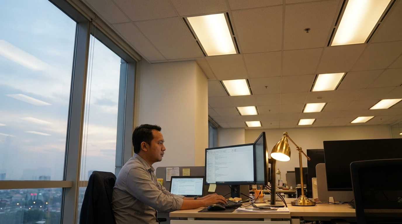
Office lighting design is mostly about avoiding the flat, uniform ceiling grid that makes staff feel like they work in a Puskesmas. A good office layer uses recessed downlights or low-UGR panels for ambient at 300 to 500 lux, task lamps at desks where people need to concentrate, and warmer accent lighting in break areas and meeting rooms to signal a mood shift.
Dimming matters more than owners realize. A 4000K panel set at 60% output feels calmer than the same panel at 100%. Meeting rooms should always dim. Video calls look better at lower light with a soft face-light in front of the screen.
Retail lighting design
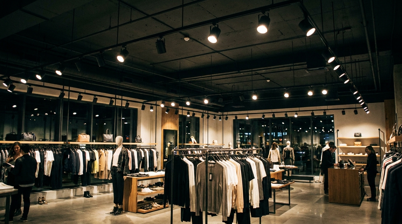
Retail lighting design lives on contrast. General store lighting at 300 to 500 lux, then track spots at 1500 to 3000 lux on the products you want customers to touch. The eye follows the brightness. If everything is equally bright, the eye wanders and nothing stands out.
Track systems are worth the money in retail because merchandise moves. Fixed downlights point at empty floor by month three. Warm-white spots on fashion (2700K to 3000K, CRI 90+) make fabric look richer. Neutral-white spots on tech or homeware. Never uniform, never flat. Contrast is the whole game. Layout and lighting have to be planned together — our notes on retail store layout go into how sightlines and spot placement pair up.
Hospitality and F&B
Restaurants want low ambient (100 to 200 lux) with clear pools of warmer light on each table. Pendant lights at 65 to 75 cm above the table read as intimate. Wall sconces at 2200K to 2700K add depth on the perimeter. Cafes trending toward all-day work-friendly light are the exception — they run higher ambient and dim into the evening. If you are planning a small F&B fit-out, our cafe design on a tight budget piece covers where lighting spend actually earns its return.
When lighting design fails, and what causes it
Most lighting failures are traceable to the same handful of decisions. A designer specifies fixtures by aesthetic without checking lux at the working plane. A contractor substitutes cheaper LED panels with unlisted CRI to save 200,000 rupiah per unit. Nobody plans dimming zones, so the meeting room and the reception share a switch. The color temperature drifts between fixtures because purchase orders were split across two suppliers, and the room ends up with three different whites.
The simplest test to catch this before construction: ask the designer for a lighting schedule showing lux target, color temperature, CRI, UGR, and dimming zone for every fixture. If they cannot produce one, they are guessing. This is the same practical scrutiny worth applying when choosing an office design firm — the answers should be specific, not stylistic.
Good commercial lighting design does not need to be expensive. It needs to be specified. Four numbers per zone, three layers per room, one color temperature per view. Get those right and the space works. Get them wrong and no amount of premium furniture will save it.
Planning a commercial fit-out in Jakarta or Tangerang? With 700+ completed projects across offices, retail, hospitality, and clinics, we specify lighting to real numbers, not vibes. Send us your floor plan and we will walk you through what your space actually needs.