


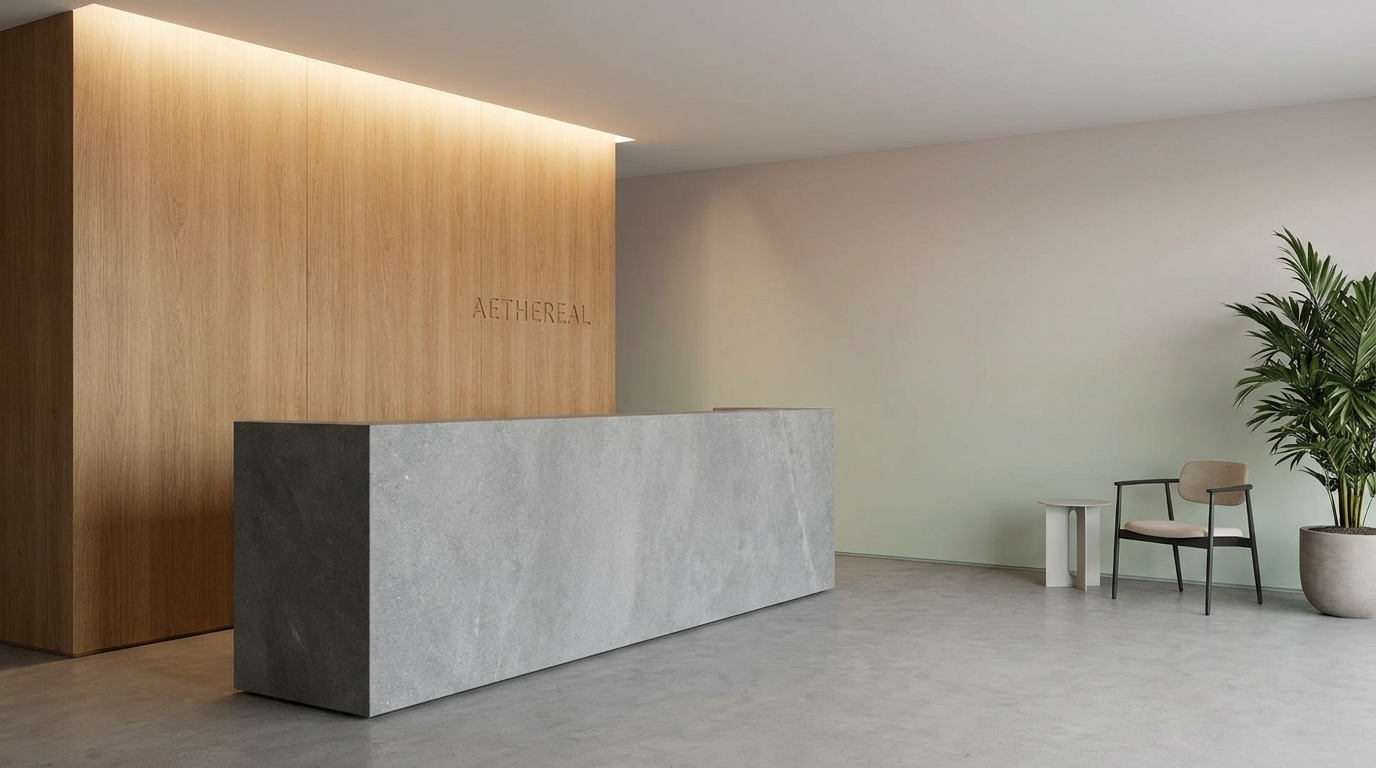
Walk into a Jakarta bank branch that spent IDR 4 billion on a refit and half of them still feel like a queue in a mid-2000s post office. Same tellers, same fluorescent light, same tired chairs in the waiting row. The logo is fresh. Nothing else moved. This is what people mean when they say a brand does not translate to the space.
Brand identity interior design comes down to one test. Does someone walking in for the first time get the same message the brand is trying to send in every ad, every deck, every website line. When they line up, the space quietly does the pitch for you. When they do not, the room is telling clients something different from what your marketing is telling them, and the room usually wins.
Start with what the brand actually promises, not how it looks
Before choosing a material or a floor plan, get honest about what your company is actually selling. A private wealth advisor sells discretion and calm. A tech startup sells directness. A hospitality group sells warmth and personal attention. These are not the same room.
Most brand alignment failures start here. The owner briefs the designer on style like modern, minimalist, industrial, instead of the promise the customer is paying for. Style is a decision downstream of positioning. If you cannot explain what your target customer values in one paragraph, no designer can build a branded commercial space that speaks for you.
We ran this exercise with a bank client where the answer surprised them. They thought they were selling stability, so the initial brief called for heavy timber and marble. When we researched their actual growth segment, which was younger professionals opening first accounts, the promise turned out to be closer to competence you can approach. The redesign traded some of the marble for lighter timber and warmer light. Customer acquisition across 150 branches went up 181 percent. Nothing about the "brand" changed. The room finally matched it.
The room speaks before you do
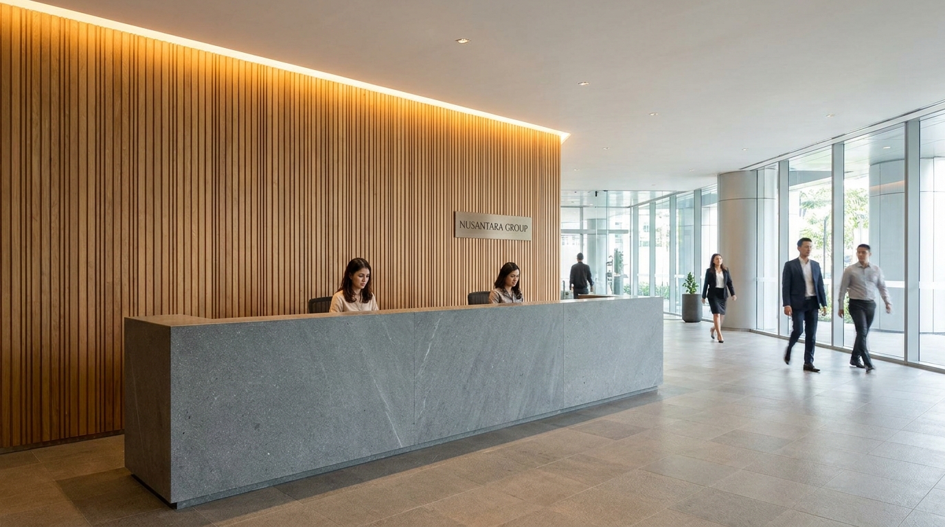
A visitor forms most of their opinion in the first ten to fifteen seconds. The receptionist has not spoken yet. The espresso has not been served. What they are reading is temperature, light, sound, and the quality of what they can touch. A cheap laminate counter tells them one thing. A stone counter tells them another. Neither is right or wrong. The question is which one your brand is supposed to promise.
This is the part clients underweight. IDR 200 million spent on a logo wall does less for brand alignment than IDR 200 million spent on the reception floor plan, the lighting temperature, and one good material at the counter. The reception and lobby set the trust before anyone says a word, and small operational choices, like where the monitor faces, how the light hits skin, whether the seating clusters or lines up like a bus stop, carry more weight than any decorative feature.
Match the space to the customer, not the owner's taste
The most common brand-space misalignment we see in Jakarta is the owner designing for their own eye. The founder loves industrial concrete and exposed brick. The customer is a corporate procurement manager who reads that as unfinished. The space is beautifully executed and the target customer walks out thinking the company is not yet grown up.
The reverse also happens. A cafe owner in her fifties fits out a space in traditional dark timber because she likes it, then wonders why the twenty-something crowd she is trying to reach is not coming in. The room is telling those customers "this is for someone older."
Interior design brand alignment starts with a simple question the designer should be asking in the first meeting. Who is the person you want walking in the door, and what do they need to feel the moment they cross the threshold. If the answer is "a young professional who wants a quick, quiet place to work for two hours," the design brief writes itself. This is the same logic that separates a well-designed retail store layout from a beautiful shop that no one buys anything in. If the answer is the owner's taste, the brand is going to leak.
Trying to work out whether your space actually reflects your brand? We can walk your floor plan and finishes before you commit to a direction that fights the customer you are trying to attract.
The details that carry brand more than the logo wall
If you have a budget of IDR 500 million for a brand-aligned commercial space, here is roughly where it should go, in order of what customers actually pick up on.
Materials come first. A solid stone or a proper timber veneer at the customer touchpoint (counter, table edge, front-of-house wall) reads as expensive within a metre. Painted MDF at the same touchpoint reads as budget-conscious within the same metre. Nothing about the logo wall or the artwork changes that.
Lighting comes second. Warm white LEDs at 2700 to 3000K with a colour rendering index above ninety flatter skin, food, and product. Cool 4000K panels flatter almost nothing. If the room's brand promise is warmth or hospitality, cool light quietly contradicts it every hour of every day. Our notes on lighting design for commercial spaces go deeper on the numbers that matter.
Sound comes third and is the most ignored. A hard-surface reception with concrete floors and glass walls that bounce every phone call and delivery signals "we are still figuring this out," even if the finishes cost a fortune. A soft rug, a fabric panel, an upholstered bench, these read as considered.
Furniture proportion comes fourth. Chair height, table height, arm placement, cushion softness. Most designers do not test seat comfort against how long a customer will actually sit. If a customer is meant to stay for an hour, the chair should support that. If they should stay for ten minutes, it should not. Both are brand decisions.
The logo wall, if you still want one, comes last. A restrained brand mark on a well-finished wall does more than a wall-sized logo on a badly finished one.
Consistency across every touchpoint
A branded commercial space is not a single hero photograph. It is every corner a customer or employee sees over an average visit. If the reception is minimalist and calm and the restroom is a cheap tile job with a supermarket mirror, the brand story breaks in the restroom.
The same is true across locations. Multi-outlet brands like banks, retail chains, and F&B groups leak equity when each location was built by a different contractor to a slightly different spec. Standardise the elements customers touch and see. Materials, lighting temperature, signage type, uniform, music. Even the smell. Vary the layout to fit the site. Do not vary the brand cues.
Be careful with trends. Jakarta's humidity has a habit of killing finishes that look great in a Copenhagen mood board, and a lot of what looks fresh in current commercial design trends in Indonesia will not age well. A trend that does not fit your brand or your climate pulls the whole space down with it. Choose materials and moves that will still read as the same brand in five years.
Good brand alignment is boring to describe and immediately felt in the room. When the space works, no one talks about the design. They talk about the company.
Planning a fit-out where the space has to carry the brand for the next decade? We work on commercial interiors where the room does the pitch before anyone speaks. Let's talk through what your space actually needs.